03 MEDICAL CLINIC / SEXUAL HEALTH SHIPPED
Innovamed
A sexual-health clinic where trust is the product. I built the visual identity and design system, then implemented it across all nine views of the site.
/ 01 / CONTEXT
The problem.
Innovamed is a sexual-health clinic with practices in Córdoba and Buenos Aires. The site had a delicate job to do: speak about intimate subjects with medical seriousness but also with warmth and discretion, build trust, and lead the visitor to book a consultation.
In this field trust is the product. People arrive looking for information about things they rarely discuss openly — desire, hormonal imbalance, sexual dysfunction — and they need a site that informs without exposing them. The challenge was building an identity that reads as credible from the first screen, and holding it consistently across nine distinct views without ever tipping into the explicit or the saccharine.
I designed the identity and the full UX/UI, wrote and structured the site’s content, and built the entire frontend.
/ 02 / SYSTEM
Design system.
A small, disciplined system — one typeface, a monochrome purple palette and a tight set of components — applied to every view. Cohesion is what earns trust, so the rules mattered more than the individual screens.
PALETTE04
- --purple-deep #2E0F45 Dark grounds, gradient base, footer
- --purple-intense #45246C Primary actions, titles, icons
- --purple-medium #6736A4 Accents, hovers, kickers on light
- --purple-light #C4AEE2 Badges, kickers on dark, soft detail
TYPOGRAPHY
- FAMILY
- Inter — 400 / 500 / 600 / 700
- ICONS
- Material Symbols Rounded
- HERO
- 48 / 32px · weight 500
- SECTION
- 40 / 30px · weight 600
- KICKER
- 13px · 0.18em · uppercase
- BODY
- 15–18px · line-height 1.5–1.7
RULES_THAT_HOLD_IT_TOGETHER
- The arrow-in-a-circle and the lilac icon badge are the two motifs that tie every view together — one card pattern, one seal, repeated everywhere.
- Kicker plus headline opens every section, so hierarchy is structural rather than decided page by page.
- One violet per context. No colour ramps that clash, and no loose hex values outside the palette.
- Headline weight drops to 500 on dark grounds — light text on dark blooms optically and reads heavier than the same weight on white.
/ 03 / PROCESS
Key decisions.
- 01
DESIGN
Discretion as a visual rule
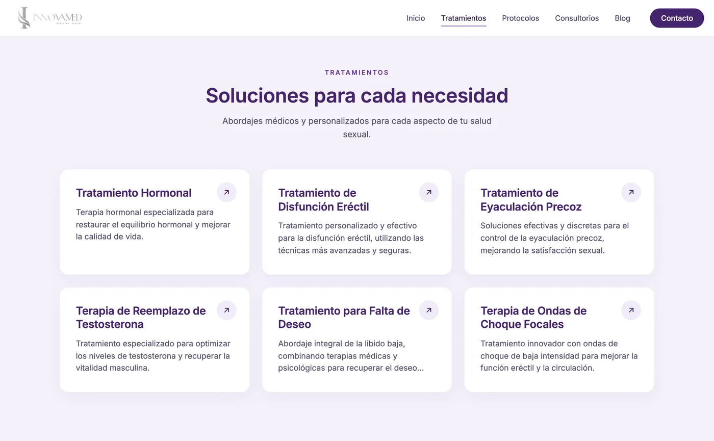
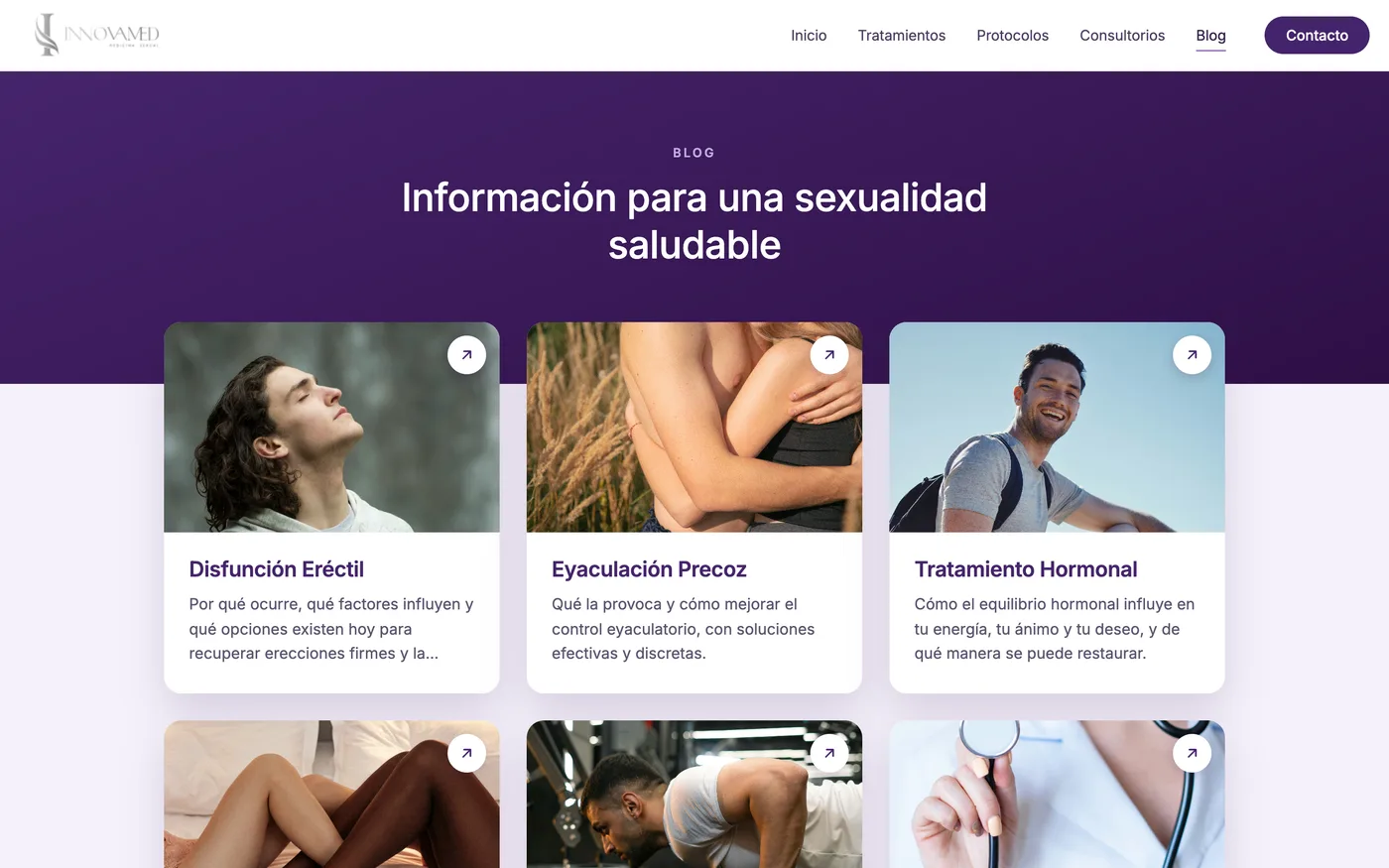
The treatment cards carry no photography. In this field imagery turns corny or uncomfortable fast, so I built them as a typographic system — title, short description, an arrow in the corner, the whole card clickable. It communicates better and it turns discretion, the brand's core value, into a visible design decision rather than a claim.
- 02
DESIGN
Editorial hero
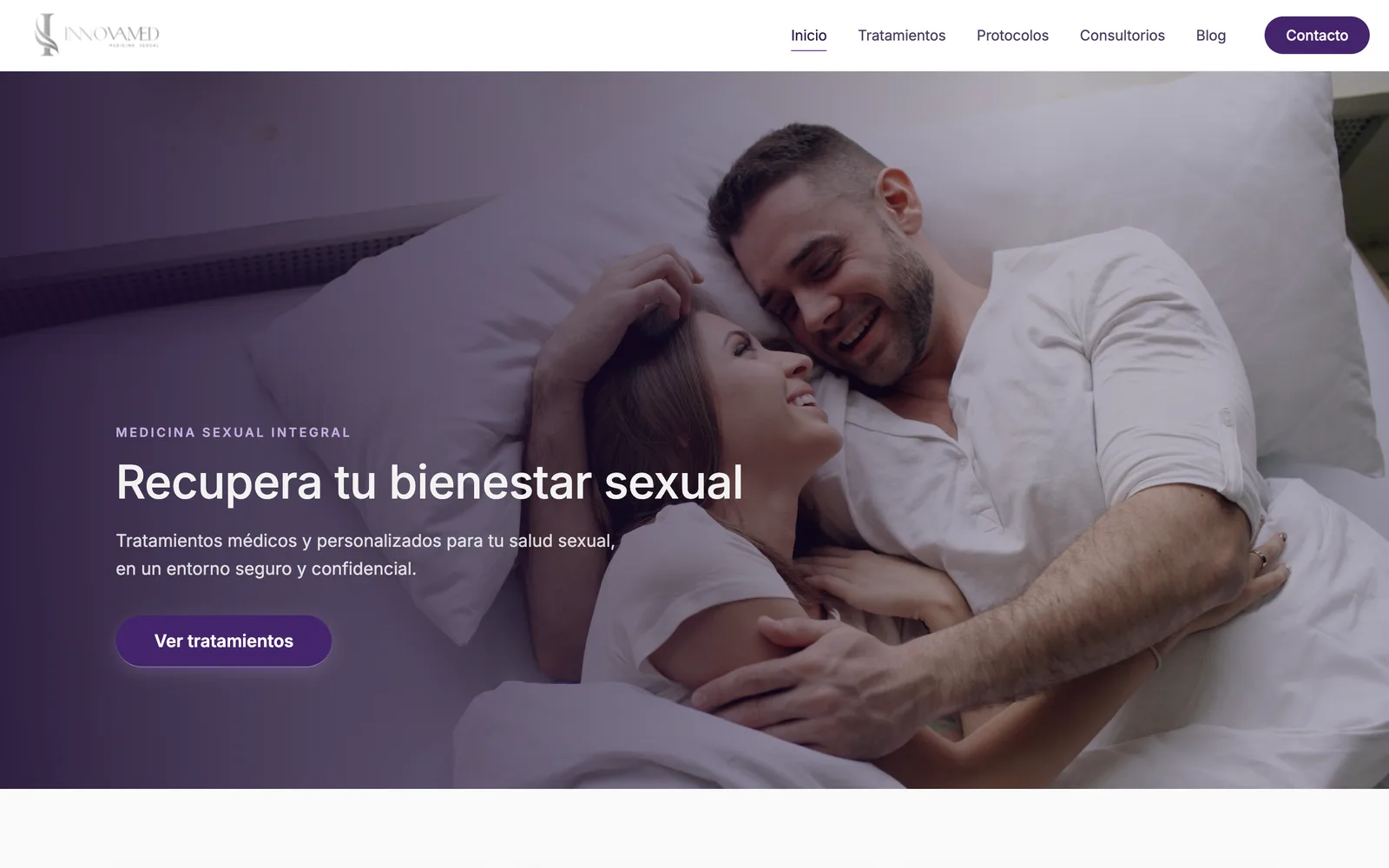
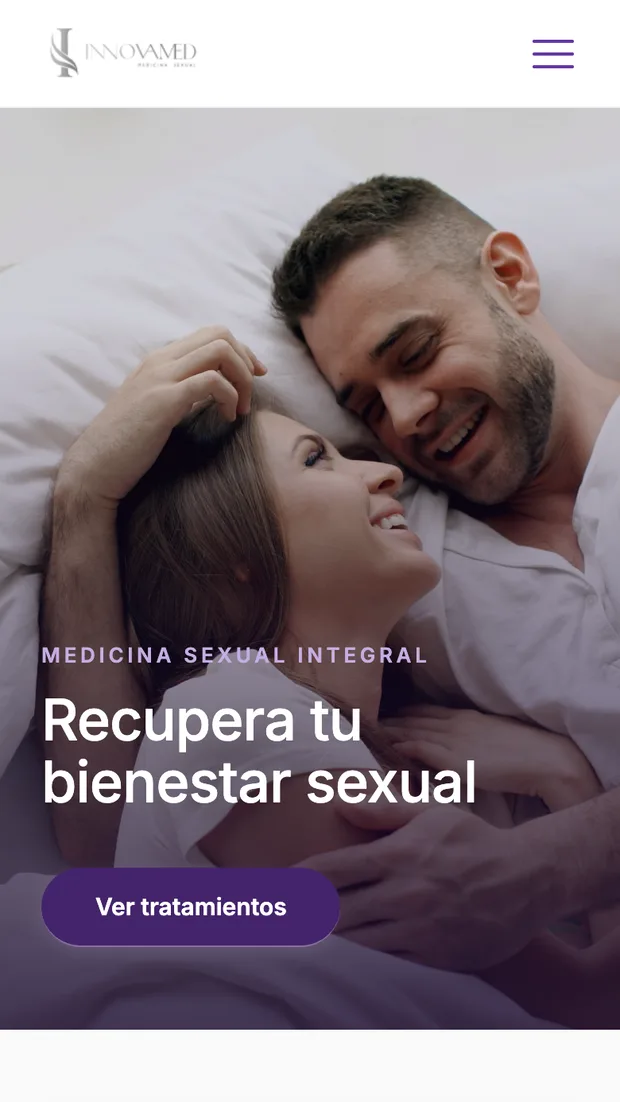
A full-bleed photograph, mirrored so the faces sit on one side and the copy composes over the empty half. A purple gradient scrim guarantees text contrast without flattening the image. The structure — kicker, title, description, CTA — then repeats across every page header.
- 03
DESIGN
Page pattern and rhythm
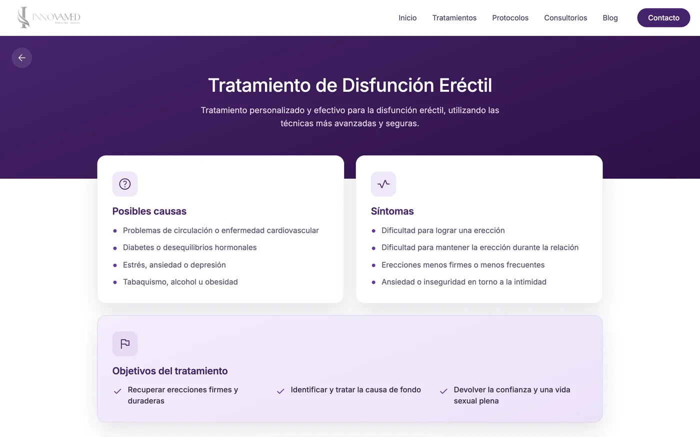
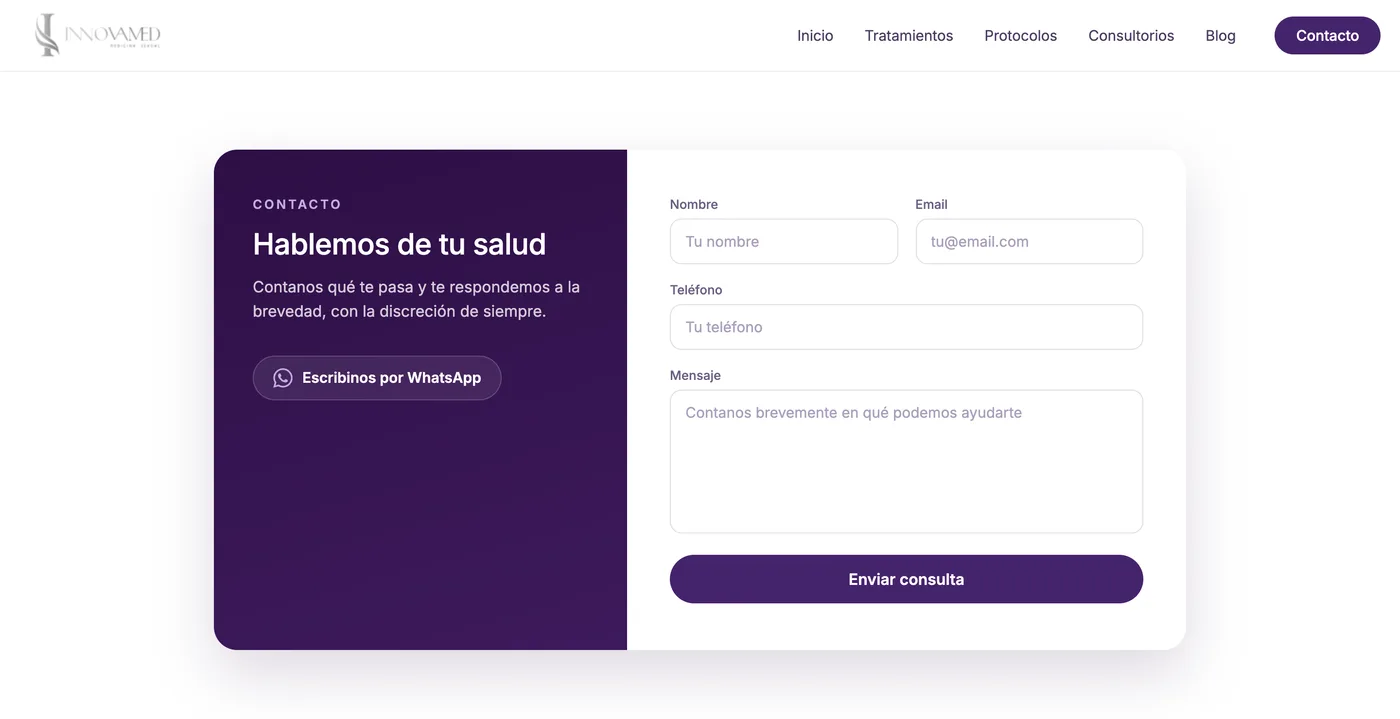
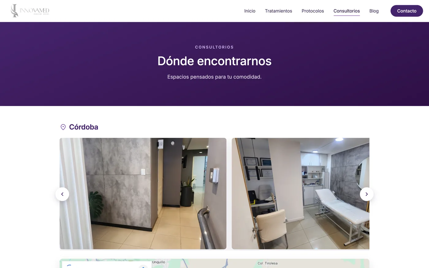
One repeatable pattern carries the listing and detail views: a purple band up top, cards floating over its edge on negative margin. Across the site, dark blocks (hero, testimonials, contact) alternate with light ones (highlights, treatments, blog) so long pages breathe instead of flattening into one texture.
- 04
FRONTEND
Independent data sources
Blog, treatments and protocols are modelled as separate typed TypeScript sources rather than one shared content blob. They evolve independently, with no cross-effects and no duplicated content — the decision that made the site cheap to extend later.
- 05
FRONTEND
Interactions without libraries
Carousel and lightbox in vanilla JS with arrow, keyboard and swipe support, and a mobile drawer with a focus trap that honours prefers-reduced-motion. React loads only where interactivity actually lives, so the rest of the site ships as static HTML.
- 06
DESIGN + BUILD
Responsive as restructuring
Mobile is not the desktop scaled down. Image framing is configurable per record via object-position, aspect ratios differ between breakpoints, and the treatments section becomes a faded preview instead of a full grid. Recoloured SVG icons through CSS mask keep one asset working across the whole palette.
/ 04 / VIEWS
The screens.
/ 05 / RESULT
What shipped.
Before this, Innovamed had no web presence beyond social media. The site gave the practice a place of its own — somewhere people can research treatments privately, read about the protocols and get in touch, without a feed in between. It holds one identity end to end across nine views, reading with the seriousness a medical practice needs and the warmth the subject demands. For a clinic dealing in intimate subjects, a site of its own is itself the credential: it is what makes a service look legitimate enough to trust with a first consultation.
NOTE // No measured impact to report. The engagement ended at handoff and there was no analytics or follow-up afterwards, so what I can honestly claim is the delivery and the baseline it changed — not numbers.
/ 06 / DEBRIEF